Monday, November 14, 2011

Quick Overview of User Experience for Web Designers

How many times have you been in the following situation? You just spent two weeks working on a design that you’re showing to a client. He likes it, but he wants to make a couple of changes that would take a couple more hours of work. Why? You don’t know.
He doesn’t know. Nobody knows. He just thinks that adding an embedded map on the right side of the web page is cool. He really likes his own idea and wants you to make the change, and you’re left with one of two options: make the client happy, or make users happy.
We all know who signs the check.
Luckily, there is a third option: Using User experience (UX) to back your arguments.
In my design career, there hasn’t been a project where the client didn’t request to make design changes that felt subjective and unjustifiable, and there hasn’t been a case where UX hadn’t come to the rescue.
UX takes clients off the center of their own arguments, and puts users back in the center of the design, therefore turning subjective (and sometimes egotistic) design change requests into rational arguments that benefit the user.
User experience not only guarantees that designers and clients are moving forward on a common ground, but also aligns future changes and product updates with the original product vision, hence ensuring long term design integrity.

What is UX?

It is a framework where beautiful designs happen as a result of identifying the right problems and finding the best solutions for them.
Contrary to popular belief, UX is not a pure creative process, but rather a rational sequential repeatable process that can be applied to solving design challenges. It is concerned with how users feel when they use the end-product.

Integrating UX into Your Design Process

So before launching Photoshop, or even creating sketches and wireframes, take the following steps to guarantee that you’re solving the right design problems.
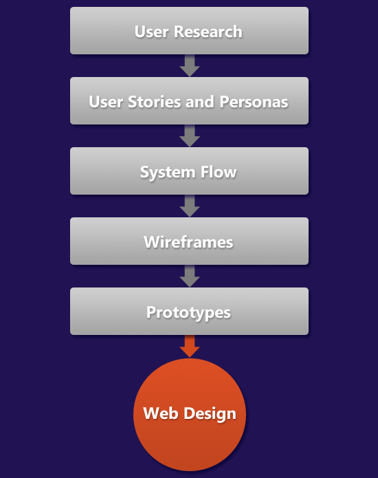
User Research

Start by doing some user research to identify the target audience. Whether you’re designing a website or a mobile app, create simple descriptions of the ideal users, their demographics, their technical proficiency, and their goals.

User Stories and Personas

Then write a couple of short stories about how they will use the product to accomplish these goals. At this stage, don’t be concerned with too much detail, but rather try to identify high-level use case scenarios. This activity is called creating personas.

System Flow

Based on these stories, draw a diagram of the system:  a snapshot of the main entities and how they relate to, and interact with, each other.
For instance, I am working on a web app that enables companies to find the right users for early testing, so I created entities for users, companies, and studies.
Then I draw arrows between these entities to indicate relationships such as "a company can create/edit/delete a study" and "users can browse/view/apply to a study".
If you’re familiar with database design, this is similar to creating an Entity Relationship Diagram (ERD).
So far, we’ve been working in problem space: We’re staying at a high level, and we’re not concerned with too much detail. At this stage, momentum is more important than trying to get everything right in each step before moving to the next. Because the process is iterative, you can always go back to a previous step to add or modify something.
Now that the problem and its attributes are defined, it’s time to move into solution space.

Wireframes

Start by outlining all the screens needed, and how users will transition between them. For each screen, identify one or two task to be accomplished, and the next steps to be reached.
Then sketch high-level block designs for each screen, stepping back every once in a while to do a quick walkthrough of the design using the stories you wrote in the second step.
Once the high-level design is congruent with the previous steps, add more detail to each screen, still doing design walkthroughs whenever possible to ensure that the users flow intuitively through the screens.
I often go through all these steps using pen and paper, or a whiteboard. This helps me stay focused on what I want to do rather than being constrained by what an app can or cannot do.

Prototypes

The final step is to prototype some screens, and click through them to get some feedback for how the design feels when it’s live. I usually use Apple Keynote and Keynotopia, and it doesn’t take more than a couple of hours to put something together that I can show to clients and prospective users and get quick feedback about.

Reference: http://sixrevisions.com/web_design/overview-user-experience-webdesigners/

8 ways to deal with negative comments in online communities

How do you respond to a negative comment in an online community,  on Facebook? Shut the Page down, ban the commenter, suck up to them? How about a bitchy tweet on Twitter? Fight with them? Ignore them? Promise to do better? Many social media guidelines have a one-size-fits-all approach when it comes to addressing negative criticism in social networks, but assessing the situation and the potential positive vs negative outcomes of responses is a skill that comes from experience. PS:  Your marketing intern may not have that skill!
NegativeComments


Another common question is how to be “authentic, honest, transparent” and human yet corporate-y. Well, every company does it differently, but let’s look at corporate vs personal voice when dealing with negative comments.

1. Ignore the negative social media commenter.

Everyone will eventually get bored and find something else to do. Unless they go off and create an anti-community such as Dell Hell, alert the Press and continue to pursue their point of view. One negative reviewer may disappear OR connect with others.We often use “ignore but monitor” in our communities for issues we know about and have responded to publicly already OR where the member is new, a bit crazy or usually positive but having a bad day. Appearing to ignore can also leave room for more debate to grow which, when managed, is a good thing!
From imaginearea (a poet):
I wrote a poem entitled ‘Teenagers’ a few days ago. It was the first poem I had ever written. I was completely unprepared for some of the negative comments I received.
I am not against negative comments but abusive negative comments can feel really painful.
After getting over my initial shock I realised that these comments were actually doing me a favour…they created a heated debate between those who loved my poem and those who didn’t…this led to much more traffic to my article than I would have got if all the comments were positive.
In short, I know I must develop a thick skin to protect me from the abusive comments but I must also see all comments as much needed PUBLICITY for my work. (successful blog)
I’m not convinced that the social media equivalent of “any publicity is good publicity” works, but it certainly makes you known. For better or worse.

2. Lawyer Up!

Sue them, or at least threaten to sue them. Send out letters to tell them you MIGHT sue them if they don’t remove the item. Sometimes it works such as when Volkswagen told some YouTubers to remove the VW logo and colours from a video, other times it can blow up a large online community e.g.  threatening to sue Whirlpool.net.au on behalf of 2Clix (2Clix Sucks?). Something bad that had only a few views suddenly jumps to millions when you tell the online community Digg to remove information (The Hole That Digg Dug). Law as bullying tactic rarely works, it just incenses the community. But using the Law when someone is out of control can be pursued when nothing else works. Though to be honest the crazies in my communities over the years rarely listen even to cease and desist orders.

3. Deflect to a more positive discussion

This one is recommended a lot by social media “experts” – thank the commenter, ask for more information and then bury them in talking. If there is more than one negative reviewer, try the “thankyou – oh look something shiny!” approach. In one case our community that had been quiet were suddenly up in arms about the change of a logo (yep seriously, in an online game). We realised they were bored. So we ran (in the virtual world) an Olympics for them and they shut up about the logo change. Try saying “thankyou – and here’s a competition for you”. It won’t fix their ‘problem’ but if their problem was boredom or just community induced psychosis, a campaign, game or competition will cheer their little souls up mightily. :P But be warned, when Marketing are put in charge of social media, rather than customer service, people figure out very quickly that all they will get back is chatter, not fixes.

4. Remove the comment, Ban the commenter

Remove the comment, remove the commenter, remove the responses to the commenter. Ignore any site you don’t have control over and come down hard on the ones you do have control over. This one works suprisingly well over the “me-too” commenters who settle down quickly. But it’s not going to last forever. A good backup is to remove the comments from say, the Facebook page and the note in the sidebar and in the comments every so often “the official channel” for reporting issues and concerns. Really depends on your community if this will work  – and the timeliness of your removal of issues, and the strength of your moderators. Just remember, the community trusts the moderators to keep a social network (like a Facebook Page) safe and relatively free of nastiness – it’s actually your duty to remove really bad comments and commenters. Freedom of speech belongs on their own page, not yours! We are also judged by the company we keep – “social” media does not have to mean “friends to all”. Feel free to filter out – block or ban – those who do not share the value systems of the community.

5. Educate the disgruntled customer

This can sit under Corporate voice or Human voice.  Use every negative comment as an opportunity to educate.  When you see someone tweeting how a your product failed them, on Twitter, respond on your blog with news of the upgrade, a workaround or information on how to improve the issue. You don’t have to refer to the Twitterer in the article, if you think it will inflame the commenters more, but certainly respond with educational material. And sometimes the customer is just plain wrong – misunderstood, didn’t install properly, didnt’ read the instructions. Educate one, usually means educating many in social networks online.  Many a negative comment is a cry for help – telling them how to fix the problem will sometimes kick back a positive review to follow the negative one. I see this a lot on iTunes – edited reviews with a fix for the problem.

6. Confess All and Beg Forgiveness

There is a temptation to use this one a lot, especially by social media newbies. I’m not sure why the need to say “sorry” to consumers who are ignorant, wrong, rude, and bullsh*tting comes from, unless it’s the out of date mandate of “the customer is always right”. Or fear that the customer could do a better job of antimarketing the brand than the marketing department can do of marketing the brand. Or just that good old fashoned “OMG someone doesn’t like me/us”. I think it’s dangerous to overuse Confession and Beg Forgiveness – unless you really screwed up bigtime e.g. BP Oil Spill, Exxon, and so on. Remember if your values are a little offbeat such as Cotton On (baby shaker t-shirt) then you will get heatedly discussed about online – change your values or use one of the other options to deal with negative comments. Timely apologies for delays and a good explanation and asking for patience is fine. Thanking the community for their input and a promise to get back to them (and do it!) is great.  But do not go overboard with confession/begging – communities sense weakness and often intensify the debate to see more grovelling, while capturing the moral high ground.

7. Stand up and Fight

Consumers, as much as companies are not ready for the shift to engagement. Shouting out loudly about bad service can sometimes bring about a response from the company who equally loudly names and shames the customer. When two blondes claimed they were denied service on an American airline, that airline took to YouTube to point out it was not because the blondes were “prettier than the cabin crew” as claimed, but because they acted up. This one is easier for small companies who are passionate about their products and services and have no compunction to come out swinging if denigrated online, but harder for big companies to do.

This may end up being the most important response you can make to World War Three breaking out online – as groups with different value systems move into each others ‘ circles, our politically correct lives are about to be turned upside down. But it’s necessary – lack of debate leads to stagnation. Prepare to take on your customer, do not apologise for normal business practices and defend yourselves. Your company may just depend on strong leaders online, as the coming generations take note of corporate karma they will be observing that “those who stand for nothing, fall for anything”. PS Nestle social media admins criticising activists on their Facebook page for poor grammar and spelling is not what I mean!

8. Own It and Wear It.

Some of the best responses to online criticism I have seen have been to “own it”. Charlie Sheen is a master of turning a negative into humour. When Foursquare users were being called “douchebags” for updating their Facebook and Twitter status with their location, Foursquare brought out a much sought-after badge called… you guessed it… the Douchebag badge.
I wonder if banks will create a Skinflint Miser badge or if you can earn a Road Hog badge from the Department of Motor Vehicles? Heh probably not. But Harley Davison have “owned” badass for years, turning a negative brand image into a must have attitude. Humour and a strong sense of the brand identity can turn a negative into a positive.
What else? Have you seen a situation where the brand responded or did not respond to criticism? Did it work?

Saturday, November 12, 2011

7 Best Practices for Improving Your Website’s Usability

Writing content for web users has its challenges. Chief among them is the ease with which your content is read and understood by your visitors (i.e. its readability).
When your content is highly readable, your audience is able to quickly digest the information you share with them — a worthy goal to have for your website, whether you run a blog, an e-store or your company’s domain.
Below are a handful of dead-simple tips and techniques for enhancing the usability and readability of your website’s content.
These tips are based on research findings and suggestions by well-regarded usability experts such as Jakob Nielsen.
This list is not exhaustive, and is meant merely to arm you with a few ideas that you can implement right away. If you have additional tips to add, please share them in the comments.

General Goals of User-Friendly Web Content


Usable, readable web content is a marriage of efforts between web designers and web content writers.
Web pages must be designed to facilitate the ease of reading content through the effective use of colors, typography, spacing, etc.
In turn, the content writer must be aware of writing strategies that enable readers to quickly identify, read and internalize information.
As we go through the seven tips below, keep these three general guidelines in mind:
  • Text and typography have to be easy and pleasant to read (i.e. they must legible).
  • Content should be easy to understand.
  • Content should be skimmable because web users don’t read a lot. Studies show that in a best-case scenario, we only read 28% of the text on a web page.
What simple things can we do to achieve these goals? Read on to see.

1. Keep Content as Concise as Possible


It’s pretty well known that web users have very short attention spans and that we don’t read articles thoroughly and in their entirety. A study investigating the changes in our reading habits behaviors in the digital age concluded that we tend to skim webpages to find the information we want.
We search for keywords, read in a non-linear fashion (i.e. we skip around a webpage instead of reading it from top to bottom) and have lowered attention spans.
This idea that we’re frugal when it comes to reading stuff on the web is reinforced by a usability study conducted by Jakob Nielsen. The study claims a that a 58% increase in usability can be achieved simply by cutting roughly half the words on the webpages being studied.
Shorter articles enhance readability, so much so that many popular readability measurement formulas use the length of sentences and words as factors that influence ease of reading and comprehension.
What you can do:
  • Get to the point as quickly as possible.
  • Cut out unnecessary information.
  • Use easy-to-understand, shorter, common words and phrases.
  • Avoid long paragraphs and sentences.
  • Use time-saving and attention-grabbing writing techniques, such using numbers instead of spelling them out. Use “1,000″ as opposed to “one thousand,” which facilitates scanning and skimming.
  • Test your writing style using readability formulas that gauge how easy it is to get through your prose. The Readability Test Tool allows you to plug in a URL, then gives you scores based on popular readability formulas such as the Flesch Kincaid Reading Ease.

2. Use Headings to Break Up Long Articles


A usability study described in an article by web content management expert Gerry McGovern led him to the conclusion that Internet readers inspect webpages in blocks and sections, or what he calls “block reading.”
That is, when we look at a webpage, we tend to see it not as a whole, but rather as compartmentalized chunks of information. We tend to read in blocks, going directly to items that seem to match what we’re actively looking for.
An eye-tracking study conducted by Nielsen revealed an eye-movement pattern that could further support this idea that web users do indeed read in chunks: We swipe our eyes from left to right, then continue on down the page in an F-shaped pattern, skipping a lot of text in between.
We can do several things to accommodate these reading patterns. One strategy is to break up long articles into sections so that users can easily skim down the page. This applies to block reading (because blocks of text are denoted by headings) as well as the F-shaped pattern, because we’re attracted to the headings as we move down the page.
Below, you’ll see the same set of text formatted without headings (version 1) and with headings (version 2). See which one helps readers quickly skip to the sections that interest them the most.
What you can do:
  • Before writing a post, consider organizing your thoughts in logical chunks by first outlining what you’ll write.
  • Use simple and concise headings.
  • Use keyword-rich headings to aid skimming, as well as those that use their browser’s search feature (Ctrl + F on Windows, Command + F on Mac).

3. Help Readers Scan Your Webpages Quickly


As indicated in the usability study by Nielsen referenced earlier, as well as the other supporting evidence that web users tend to skim content, designing and structuring your webpages with skimming in mind can improve usability (as much as 47% according to the research mentioned above).
What you can do:
  • Make the first two words count, because users tend to read the first few words of headings, titles and links when they’re scanning a webpage.
  • Front-load keywords in webpage titles, headings and links by using the passive voice as an effective writing device.
  • Use the inverted pyramid writing style to place important information at the top of your articles.

4. Use Bulleted Lists and Text Formatting


According to an eye-tracking study by ClickTale, users fixate longer on bulleted lists and text formatting (such as bolding and italics).
These text-styling tools can garner attention because of their distinctive appearance as well as help speed up reading by way of breaking down information into discrete parts and highlighting important keywords and phrases.
What you can do:
  • Consider breaking up a paragraph into bulleted points.
  • Highlight important information in bold and italics.

5. Give Text Blocks Sufficient Spacing


The spacing between characters, words, lines and paragraphs is important. How type is set on your webpages can drastically affect the legibility (and thus, reading speeds) of readers.
In a study called “Reading Online Text: A Comparison of Four White Space Layouts,” the researchers discovered that manipulating the amount of margins of a passage affected reading comprehension and speed.
What you can do:
  • Evaluate your webpages’ typography for spacing issues and then modify your site’s CSS as needed.
  • Get to know CSS properties that affect spacing in your text. The ones that will give you the most bang for your buck are margin, padding, line-height, word-spacing, letter-spacing and text-indent.

6. Make Hyperlinked Text User-Friendly


One big advantage of web-based content is our ability to use hyperlinks. The proper use of hyperlinks can aid readability.
What you can do:

7. Use Visuals Strategically


Photos, charts and graphs are worth a thousand words. Using visuals effectively can enhance readability when they replace or reinforce long blocks of textual content.
In fact, an eye-tracking study conducted by Nielsen suggests that users pay “close attention to photos and other images that contain relevant information.”
Users, however, also ignore certain images, particularly stock photos merely included as decorative artwork. Another eye-tracking study reported a 34% increase in memory retention when unnecessary images were removed in conjunction with other content revisions.
What you can do:
  • Make sure images you use aid or support textual content.
  • Avoid stock photos and meaningless visuals.

Reference : http://mashable.com/2011/09/12/website-usability-tips/

Wednesday, October 26, 2011

Nokia unveils first Windows phones - The company also launched four low-cost devices for developing markets with smartphone-like features

Nokia unveiled on Wednesday four new phones intended for developing markets as well as the company's first two smartphones running the Windows Phone operating system.
The Asha series, which runs the Symbian S40 operating system, is equipped with features often seen on smartphones but not on lower-end ones, such as Qwerty keyboards and touchscreen capabilities. The four devices will range in price from €60 (US$83) to €115.

Nokia also launched the Lumia 710 and the Lumia 800, premium devices intended to compete with Apple's iPhone and devices running Google's Android operating system. Nokia's Kevin Shields, senior vice president of program and product management, took a jab at the two competing operating systems, saying that Windows Phone doesn't just have a "lame group of icons that just sit there doing nothing."
The Lumia 800, which will retail for €420 without taxes or subsidies, will be available in some European countries next month, said Nokia CEO Stephen Elop. The Lumia 710 will cost €270.

Nokia is keen to show that the product is close to arriving in stores. The first units are already shipping, according to Elop. A video link from its factory in Salo, Finland showed a Nokia employee packing up a unit.
The Lumia devices represent Nokia's first big effort with the Windows Phone operating system after the company announced a partnership with Microsoft in February. Both of the smartphones runs Windows Phone 7.5, known as Mango.

"Lumia means light," Elop said. "It's a new dawn for Nokia."
The Lumia 800 has a 3.7-inch screen, 16GB of internal memory and 512MB of RAM. It has a 1.4GHz single-core processor with hardware acceleration and a graphics processor. It will come in cyan, magenta and black. Its camera has optics from Carl Zeiss with a resolution of 8 megapixels.
The 800 will be available in France, Germany, Italy, the Netherlands, Spain and the U.K. in November from 31 operators and retailers. Before the end of the year, it will be available in Hong Kong, India, Russia, Singapore and Taiwan and other markets by early 2012.

The Lumia 710 has the same 1.4 GHz single-core processor as the Lumia 800 and has the same hardware acceleration feature and graphics processor. It has 8GB of internal storage and 512MB of RAM. The 710 has a 5-megapixel camera. The 710 will come in black and white as the base color, but users will also be able to switch back covers in colors such as black, white, cyan, fuchsia and yellow.

The 710 will be first available in Hong Kong, India, Russia, Singapore and Taiwan toward the end of the year and elsewhere next year. Elop did not mention whether either the 710 or 800 will be sold in the U.S., but said Nokia will have a "portfolio of products" for that market early next year.

Both of the Lumia smartphones are equipped with Nokia Drive, a navigation application that vocalizes directions. The company has also partnered with the network ESPN for a "Hub" application centered around sports.

The Asha series are designed for "aspirational" users in developing countries. The devices are priced much lower than the Lumia line but incorporate elements present in smartphones. Elop said the products blur the line between smartphones and other mobile devices.

Tuesday, October 25, 2011

Users can now replace Blogger profile with Google+ profile -- It's the first integration between Google+ and Blogger

In the first integration between the Google+ social networking site and the Blogger blog publishing platform, users will be able to replace their Blogger profiles with their Google+ profiles, the company announced on Monday.

The benefits for Blogger publishers of using the Google+ profile include giving their readers "a more robust and familiar sense of who you are" as well as having their posts surface with an annotation in the search results of their social connections, Google said.

"Plus, bloggers who switch will automatically get access to the Google+ integrations we'll be rolling out in the future," wrote Vardhman Jain, a Google software engineer, in the post.
Of course, since Google+ requires that people use their real name, doing this profile switch may not be a good option for the many bloggers who publish using a pseudonym.
"That's why we've made it completely optional to switch," Jain wrote.

The option to replace a Blogger profile with a Google+ profile is available in Blogger In Draft, the testing site where Blogger publishers can turn on new features before they're generally available to everyone on Blogger.
Google expects the profile replacement option to be ready for all Blogger publishers through the main Blogger site "in the coming weeks."

Google officials, from CEO Larry Page on down, have made it very clear that Google+ isn't meant to be just a stand-alone social networking site, but rather a unifying service that ties Google products together and adds social components to them.

As such, the expectations for Google+ within the company are extremely high already, although it's a fairly new product launched in limited beta in June and to the general public about a month ago. It recently topped 40 million members, according to the company.

However, it's unclear whether the Google+ real names requirement will deter a significant number of users from linking their various Google accounts with Google+ because they may not want their real identity associated with some or all of those services, such as YouTube and Gmail.
For this reason, it will be interesting to see how Blogger publishers respond to this new option of slapping their Google+ "real" identity on the blogs they publish. 

It's well known that many bloggers opt to keep their identity hidden for fear of possible consequences from expressing their opinions, such as problems with their employers and political persecution in countries where dissent isn't tolerated.

Google officials have said that they plan to allow for the use of pseudonyms in Google+ at some point, but it's unclear when that will happen and to what extent it will be possible to withhold one's real identity.
At this point, it's not required for users of Google services to have a Google+ account. However, people who do opt to join Google+ must first set up a public Google Profile which, at minimum, must make their real name visible to anyone who views the page.